Animation-
The process of combining images to give the illusion
of movement.
Anti-Aliasing-
Smoothing or blending the transition of pixels in an image.
Anti-aliasing the edges on a graphic image makes the
edges appear smooth, not jagged.
Bitmap-
A bitmap is a graphic
file that is made up of square dots (pixels).
Scaling these images to larger sizes result in these pixels becoming larger which can make the image look blocky
with jagged edges..
Bleed-
Method used in print to have ink printed right up
to the edge of a page. The way this is done is by
having the document printed on a larger page. Then
the printer prints 1/8th (usually) of an
inch beyond the document size on each side, and is
then cut to size.
CMYK- The
initials of the four process colors. They are cyan,
magenta, yellow, and black. K is used for black to
not confuse people into thinking blue.
Compression-
A method used in graphics programs to shrink the size
of image files. Jpegs use compression to shrink down
file sizes, and TIFs have the option to compress using
LZW for example.
Cropping-
This involves removing the outside edges of a photograph
to remove excessive or irrelevant background content
of a photo. This technique is often used to create
interesting framing for images. Note that this is
not the same as resizing, which keeps the
image intact.
Descender-
The part of a lowercase letter that falls below the
body (baseline) of the letter. "g", "j",
"p", "q" and "y" are all examples of letters
with descenders.
Dithering-
This is a process used in making an image (like
in a GIF file that has 256 colors or less) appear
to have more colors than it really does. This is done
by blending pixels using patterns that approximate
the colors it is trying to produce. Up close, this
dithering looks quite dotty and speckled, but at a
normal viewing distance, the effect of more colors
and cleaner transitions can be obtained.
Dots Per Inch-
(or dpi) This specifies the resolution of an output
device, like a printer or printer press.
This print resolution varies depending on what
kind of output is required.
Duotone-
This is a technique which mixes two colors (Duo) which
can provide richer toned image than a monotone graphic.
The sum can be greater than its parts and give the
impression of more colors than just the two. This
can be an effective way of designing with a limited
color output budget.
Export- The
process of saving a graphics file to a format that
can be opened in another program. These formats are
usually not the native format of the program you are
exporting from.
FlightCheck-
This is a prepress program that reads a disk (or other
media) and checks for and identifies missing fonts,
embedded graphics, bad traps, and many other potential
problems.
Font-
This is the letters, punctuation, numbers and symbols
that make up a single typeface. An example of a font
is Eras Light ITC. Another font is Eras Bold ITC.
The typeface in this instance is Eras. It is the variations
of this typeface that are fonts.
GIF- (Graphics Interchange
Format)-
This is a widely used graphics format for the Internet
that allows transparency and animation. The limitation
of this format is that it the maximum number of colors
is 256. GIFs are often dithered, which can give the
illusion of more colors.
Gradient-
This is a gradual transition of two or more colors.
Greyscale-
This is a color mode where there are no colors in
use. There is just black, white, and various shades
in between. In the print world, a greyscale image
is actually made up of just black ink. The value of
the grey depends on the density and size of the black
dots printed. In photographs, halftones are produced
to simulate various shades.
GUI- (Graphical
User Interface) This is a user
interface based on graphics (icons and pictures and
menus) instead of text. When designing a website,
it is important to design the GUI effectively.
Halftone-
Process used in print for Photographs, paintings,
and drawings. Because most printing presses cannot
produce continuous tones, images are converted to
halftones to simulate continuous tones. Using fine
dots of varying size and spacing, halftones can reproduce
the shades and textures of the original image.
HTML-
(Hypertext Markup Language) This
is THE standard format for the Internet. Html pages
can include text, images, animation, video, sound,
and more.
Hue- This is another term for color.
Interlace-
This is a web graphic technique used to have an image
appear in steps (with a rough image appearing first,
and then progressively getting more detail), rather
than waiting for the full source image to appear.
This is getting less and less used as broadband Internet
picks up steam.
Italics-
This is the slanting forward of serif fonts.
JavaScript-
This is a language used to do things on the Internet
that html coding often cannot.
Jpeg- (Joint Photographic
Experts Group). This is the main format used on the Internet (and elsewhere)
for photographic/continuous toned images. Because
the Jpeg format uses compression, you can often obtain
much smaller file sizes and still maintain photographic
quality.
Justified-
This is when text is aligned vertically on the left
AND right margins.
Kerning-
This is the process of selectively adjusting the spacing
between letters pairs to improve the overall appearance.
The letter pairs that most often need some kind of
kerning treatment are AV, AY, PA, and AT. These letter
pairs often look awkward together, and need to either
be moved closer together, or further apart manually.
Keyline
-This is an image placer in layout that represents
where an image is to go when it is printed. This placeholder
doesn't print, but it fits the position and size of
the image that will b e printed in that spot.
This Keyline often is a rectangle with an x
through it.
Kilobyte (kb)-
This is 1,024 bytes of digital information.
Landscape-
The orientation of a document that is to display a
page length wise instead of up and down. A brochure
will often be a landscape document, where the width
is wider than the height.
 |

|
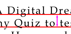
Leading-
This is the distance between the baseline of one
line of text to the next baseline of text. |
 |
|
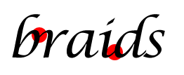
Ligature-
This is when letters in a word touch. |
Lossless Compression-
This is a way of saving a graphic file in a compressed
format to reduce the file size without any loss of
image quality. The PNG format useless this kind of
lossless compression for example.
Lossy
Compression- This is a way of saving a graphic
file in a compressed format to reduce the file size,
but at the cost of image quality. Jpegs can be saved
at various levels of compression. The higher the compression,
the smaller the file size, and the more image quality
is lost.
LPI: (Lines
Per Inch)
Mouse-over-
A technique used on the Internet where an image changes
to another image when the mouse pointer moves over
the image. An example of this is a button where it
looks like it is being pressed down when you move
the mouse pointer over it.
Multimedia
PDF-
(Portable Document Format) This format developed by
Adobe makes it possible to keep the exact fonts, format,
and layout of a document across any platform. These
files can be created in Adobe Acrobat, or any program
that can output to PDF. An Adobe Acrobat Reader is
needed to view these files.
Pica-Pica
is a unit of measure commonly used in graphic design.
Six picas equals roughly one inch (precisely, six
picas equals .9957 inches). Most graphic design programs
round off picas so that six picas exactly equals one
inch.
PNG-
(Portable Network Graphics format)
This is a lossless compression format that is used
on the Internet to display high color graphics like
photographs. You can also have transparency with PNGs,
but the file sizes can be larger.
Portrait-
The orientation of a document that displays the longest
sides of the document vertically. An example of this
is an 8.5X11 paper viewed normally.
Postscript-
This is a language used by postscript printers to
convert documents so they can be printed.
PPI-(Points
Per Inch) This is the resolution of an input
device. Examples include digital cameras, scanners,
and monitors.
Process
Color- Colors that are made up of the CMYK. By
using halftones, you can obtain photographic full
color images using just CMYK. Also known as Full Color.
Quick
Time- The video format developed by Apple that
is used on the Internet and other desktop applications.
RGB- Red,
Green, Blue. This is the common color space used on
computers. Website graphics are saved as RGB, as well
as other output that involves a monitor. Colors are
determined by mixing these 3 colors together with
values ranging from 0 to 255. Black has an RGB value
of R=0, G=0, B=0. A light purple could be a value
of is R=180, G=0, B=255.
Revert-
This is a command found in many computer applications
that returns the document to it's last saved state.
Resolution-
This determines the detail of an image based on the
amount of pixels. More pixels means higher resolution.
The higher the resolution, the better the printed
output.
San Serif-
This is type that lacks the strokes on the end of
letters that can be found on a Serif Typeface. An
example of a typeface that is San Serif is Arial.
Serif-
These are the exaggerated strokes at the ends of letters.
Type that has these markings are known as Serif type.
An example of a typeface that has serifs is Times
New Roman.
Spot Color-
This refers to a color that does not go through the
CMYK process to obtain color values. Instead, each
color in a document is created using that exact color,
not a mixture of CMYK halftone values. Spot colors
are used most often in limited color jobs where the
cost of ink is too high for 4 color CMYK printing,
or where a particular color (say for a logo) used
must be exact.
Vector Graphic-
A graphics format that uses shapes and lines, called
paths. Vector graphics are resolution independent
graphics that appear smooth and crisp regardless of
how magnified the image is on screen. They also can
be enlarged as big as you want them without having
jagged edges. This format is best for line art and
logos that don't require complicated coloring or textures.
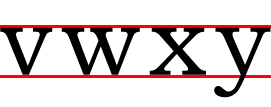
X-height-
This is the vertical height of a typeface that is
measured from the baseline to the top of lowercase
letters without ascenders. X is a letter that can
be measured this way (hence the name), as well as
a, c, e, m, n, s, and so on.
Widow-
This is a single word or line of text that is left
on the top of a page or column that was continued
from a previous page or column. This is a no no in
page layout.
WYSIWYG-
(What you see is what you get) This
is a term used for applications that show how a graphic/layout
will look while you are editing it.